OVERVIEW
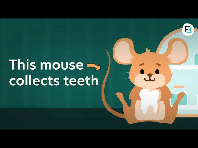
This project focused on creating an animated infographic video for YouTube that explores “10 weird tooth traditions around the world.” As the company’s first YouTube infographic, the goal was to transform informational content into an engaging, visually compelling, and easy-to-understand video experience.
My Role
Animator
My Team
Jessica Cooney, Brand Designer
HIGHLIGHTS
This is the YouTube link of the result of this project
CONTEXT
Bringing Global Traditions to Life
Turning Cultural Insights into Engaging Visual Stories
This project was initiated to expand the brand’s digital promotion by introducing YouTube infographic content as a more engaging and shareable format. With no consistent content on the platform, there was also a need to improve audience engagement and establish a stronger presence.
Infographics were used to simplify diverse information, making it easier for viewers to understand, retain, and engage with the content through clear and visually structured storytelling.
Created from scratch
YouTube platform
Pinpointing the objective
Create a cohesive and engaging YouTube infographic that simplifies cultural traditions through clear visual storytelling, while driving audience engagement and building a consistent platform presence. The content also supports audience understanding of dental topics, including how teeth work and their history.

THE PROBLEM
Managing Multi-Topic Storytelling
Balancing Variety and Consistency
Presenting 10 different traditions in one video introduced the challenge of balancing uniqueness and consistency. Each segment needed to feel distinct while still maintaining a cohesive visual style and smooth storytelling.
Additionally, all elements had to be created from scratch, from characters and environments to motion and transitions, based only on the script and narration.
Disconnected Flow Between Multiple Topics
Pinpointing the objective
Lack of Visual Differentiation Across Segments
When each segment lacks uniqueness, the content becomes repetitive, making it harder to maintain viewer interest throughout the video.
Frontier Dental Brand Visual principles must follow:
THE CHALLENGE
The challenge was to create a visually engaging infographic that presents multiple unique traditions while maintaining a smooth flow, clear storytelling, and consistent design throughout the video.
THE SOLUTION
Structuring a Cohesive Infographic Experience
Connecting Multiple Stories Through Motion
A structured infographic system was developed to organize each tradition into clear and engaging visual segments. Each topic was given distinct visual elements while maintaining a consistent overall style.
A previously designed character was reused and redesigned to better fit the YouTube infographic style, making it more flexible and expressive for storytelling.
Transitions were carefully designed to smoothly connect each segment, improving flow and creating a more engaging viewing experience.

Building a Structured Workflow
Building a Structured Workflow
The script was broken down into individual segments, allowing each tradition to be planned and visualized clearly. A structured workflow ensured consistency while managing multiple scenes efficiently.


Identifying Gaps in Flow
Early drafts revealed challenges in pacing, transitions, and maintaining consistency across segments. These insights guided improvements in visual flow and storytelling.
Refining for Clarity and Engagement
Visuals and transitions were refined to improve clarity and flow, while each topic was uniquely designed through location-based settings, character costumes, and layout variations. Consistent transitions were maintained to create a recognizable pattern and keep viewers engaged.
KEY DISCOVERY
Clear structure and smooth transitions are essential when presenting multiple topics, ensuring content remains engaging and easy to follow.
THE RESULT
Delivering Engaging Multi-Topic Content
From Fragmented Topics to Cohesive Storytelling
The final infographic successfully transformed multiple cultural traditions into a cohesive and engaging video. Structured visuals and smooth transitions improved clarity, making the content easier to understand and more enjoyable to watch.
All scene in an image
Engaging Multi-Segment Infographic Output
The final video showcases distinct yet connected segments, combining dynamic visuals and smooth transitions to maintain engagement across all topics.
Website
Enhancing Content Experience
This project demonstrated how structured infographic design can elevate informational content, making it more engaging, memorable, and scalable for future videos.
KEY INSIGHT
Effective infographic design is about structuring information clearly—balancing variety and consistency to create engaging and easy-to-follow content.